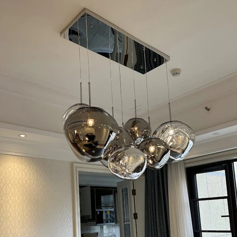
Why a Pink Chandelier Works
A pink chandelier delivers something few other lighting finishes can — genuine color personality and warm visual character that shifts the emotional tone of the entire room. Where standard neutral finishes (chrome, brass, black) blend into the interior architecture, this kind of fixture becomes a designed focal element that carries its own presence. That distinctive character makes the style particularly effective in bedrooms wanting softer intimacy, dining rooms wanting artful conversation-starting focal points, foyers wanting memorable first impression, and expressive interiors where the ceiling should read as intentional design choice rather than functional necessity.
Pink Tones: Blush, Pale, Rose, Hot Pink and Fuchsia
Pink covers a wider range than any other colour in lighting, and the tone decides the room's whole register. Five bands cover what is actually specified.
- Blush and pale pink: the quietest end — barely more than a warm off-white until the light is on, at which point the tint appears. This is the tone that suits rooms where the colour should read as a nuance rather than a statement, and the one that ages best in a nursery as a child grows
- Baby pink and light pink: clearly pink but soft, with enough saturation to read as a colour choice. The most common bedroom and nursery selection
- Rose and dusty pink: pink with grey or brown in it, which makes it sit comfortably beside neutrals and timber. The most transitional of the five, and the one that suits adult bedrooms and dining rooms without reading juvenile
- Hot pink and fuchsia: full saturation, where the fixture is the room's event. Belongs in spaces with restraint elsewhere — a white or grey room takes it, a busy one does not
- Pink-tinted crystal and glass: a different mechanism entirely. Rather than a painted surface, the colour lives in the material, so it deepens where the glass is thick and disappears where it is thin. This reads more considered than a solid pink finish and is what most people picture when they search for a pink crystal chandelier
One practical note on tone: pink shifts with the lamp. A blush fixture under 2700K warm white reads warmer and closer to peach; the same fixture under 4000K reads cooler and more mauve. Specify 2700-3000K and the tone you chose is the tone you get.
Pink With White, Black, Gold and Crystal
Pink is rarely used alone in a fixture, and the second element changes the reading more than the pink itself does.
- Pink and white: the softest pairing, and the most common in nurseries and children's rooms. White frames and shades let the pink read as an accent rather than as the whole object
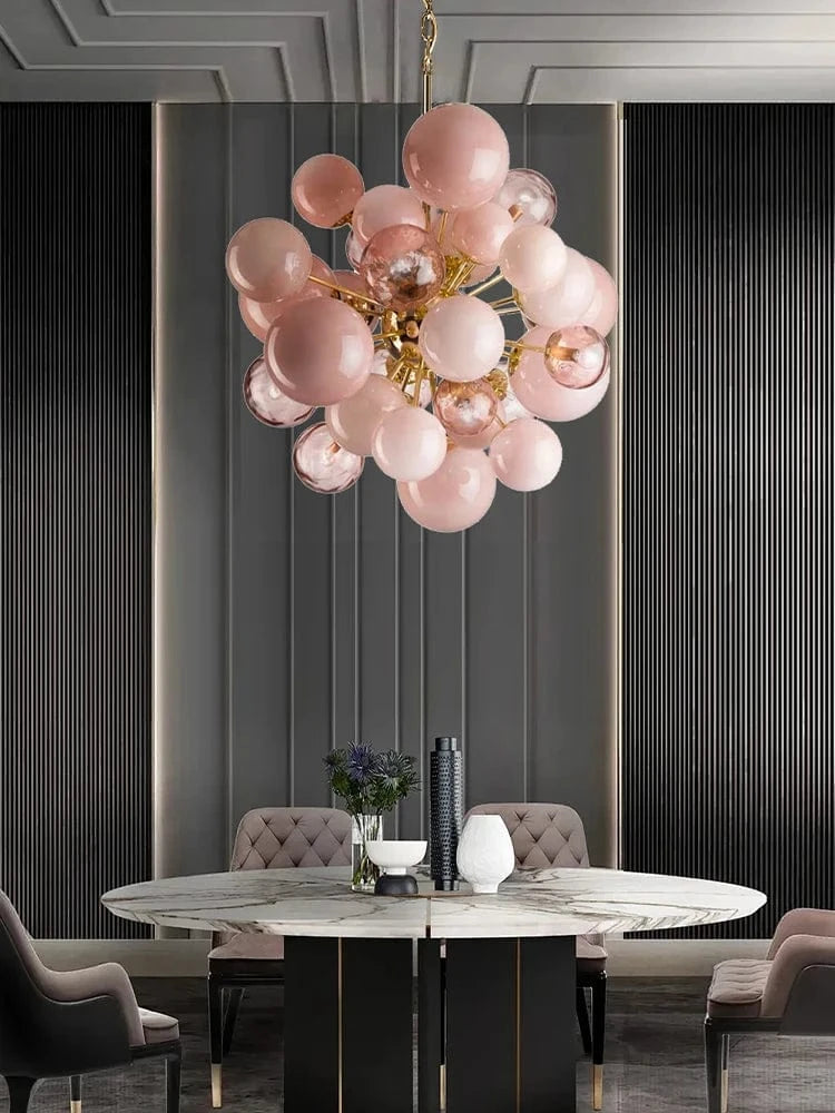
- Pink and gold or brass: warm metal beside warm pink sits in the same tonal band, so the fixture reads as one material story. The dressiest of the combinations and the one that suits a formal dining room
- Pink and black: maximum contrast, which pulls the pink toward graphic rather than sweet. This is the pairing for an adult room that wants colour without softness
- Pink and crystal: clear crystal beside pink elements, or pink-tinted crystal throughout. The refraction picks up the tint and throws faint colour onto the surrounding surfaces, which is an effect no painted finish reproduces
- Pink and chrome or silver: the coolest pairing, which pushes a warm pink toward the modern end. Works where the room's hardware is already cool-toned
Forms: Floral, Feather, Beaded and Bubble
Beyond tone and pairing, the silhouette decides how literal the pink reads.
- Floral and rose forms: the most thematic, where petal shapes make the colour explicit. Strongest in nurseries and rooms where the fixture is meant to be charming rather than restrained
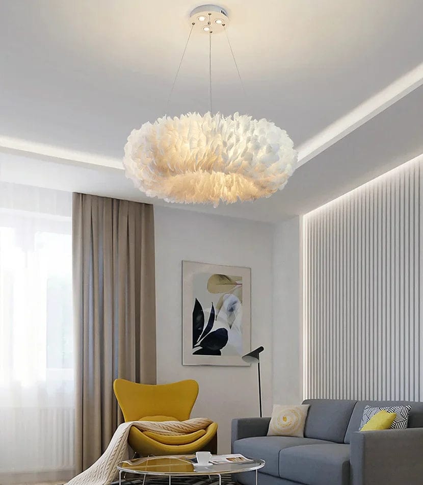
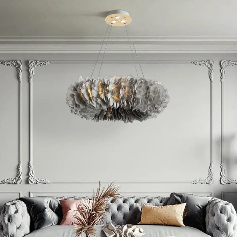
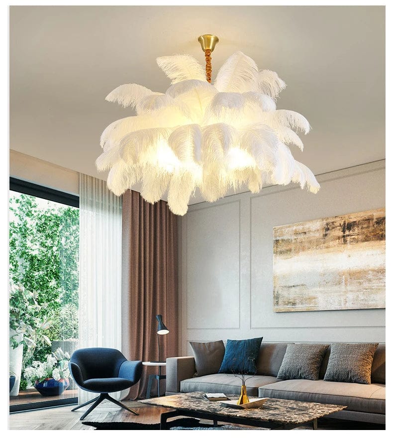
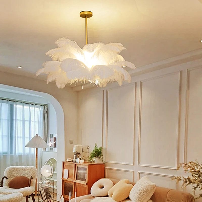
- Feather and fabric: texture rather than geometry, with a soft edge that diffuses light gently. Decorative rather than functional — plan other lighting alongside
- Beaded: repeated small elements that read as pattern from a distance and as material at close range
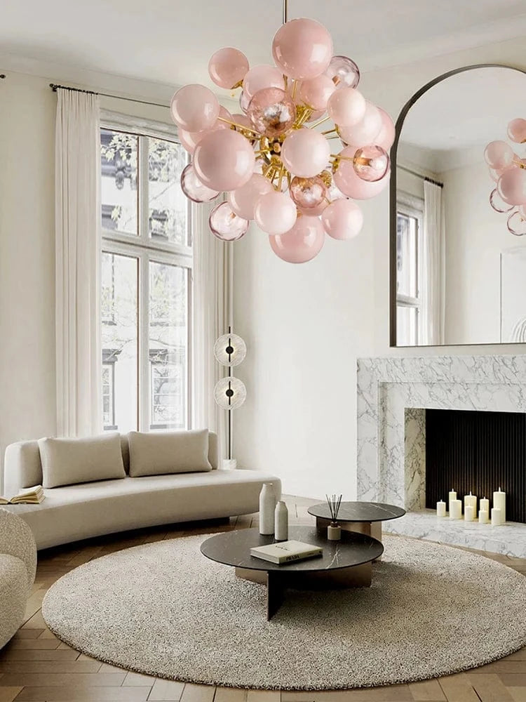
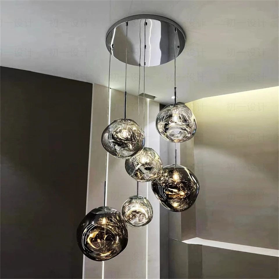
- Bubble and globe clusters: the most contemporary route into pink, where the colour sits in glass spheres rather than in a painted frame. See the bubble chandeliers collection for the format
- Clean geometric frames: pink used as a finish on a modern silhouette, which is the least thematic option and the one that suits an adult room best
Pink Chandeliers by Room
Pink Chandelier for Bedroom
Bedroom applications are among the strongest categories in this collection. A pink bedroom chandelier delivers intimate warm illumination while adding personal color character to the most personal room in the home. Adult bedrooms suit blush and rosy tones for refined personality. Children's and nursery rooms respond to lighter variants for cheerful welcoming warmth. Small options (16-22 inch diameter typical) suit standard applications; larger fixtures work in master bedroom contexts with substantial ceiling height. For dedicated bedroom-scale direction across all finish options, see our bedroom lighting collection.
Dining Room Applications
Dining applications deliver conversation-starting visual character over the table — particularly effective in modern glam, transitional luxury, and expressive contemporary dining rooms. Rosy and hot variants suit statement contexts where the fixture should read as primary artistic focal element. Pink glass chandelier options give a soft, diffused colour that changes with the light through the day and evening.
Foyer & Entry Applications
Foyer and entry applications create memorable first impression — particularly effective in modern expressive homes where the entryway should signal the interior design personality immediately. Blush tones deliver refined welcoming warmth suitable for luxury foyer contexts; hot variants deliver bold statement character for creative-forward entries.
Small & Mini Applications
A small pink chandelier or mini variant (16-22 inch diameter typical) suits compact rooms, powder rooms, small bedrooms, breakfast nooks, and secondary rooms where a substantial-scale fixture would crowd the space. This direction concentrates color character into contained scale — often more effective than larger alternatives in intimate room applications.
Two format notes that come up often. Where no ceiling box exists — a rental, a nursery in a converted room, or a bedside position — a plug-in fixture with a cord and switch is the practical route, since it needs no electrician. And for a bedside or dresser, a table lamp with chandelier-style detail gives the same decorative register at a fraction of the commitment; the table lamps collection covers those.
Materials: Glass, Crystal & Metal Combinations
Material selection changes both the visual character and how the color reads in the room. Glass diffuses light through the tinted material, creating gentle color-cast illumination that changes the ambient light quality of the room. Crystal designs combine color character with reflective specialty, delivering polished decorative statement suitable for formal dining rooms and glam luxury applications. Mixed-material compositions — pink and gold, pink and black, pink and white combinations — deliver more architectural presence, where the contrasting framework provides visual anchor and the tone reads as intentional accent rather than dominant character. For warm gold specialty that pairs beautifully with these tones, browse our gold chandeliers collection. For dedicated crystal direction, see our crystal chandeliers collection.
Modern Pink Chandelier Direction
A modern pink chandelier uses current design vocabulary — clean geometric composition, disciplined framework, contemporary material specialty — combined with color character. This direction reads more architecturally intentional than traditional alternatives, making the color choice feel like considered design decision rather than decorative accent. Modern variants pair particularly well with minimalist interiors (where the tone adds warmth), warm minimalism direction (where color coordinates with the broader warm palette), and modern glam applications. For broader modern chandelier direction across all finish and color options, see our modern chandeliers collection.
How to Choose the Right Fixture
Selection follows four sequential decisions. First, tone intensity — blush and light for calmer refined applications; rosy and hot for bolder decorative statements. Second, silhouette — glass cluster and bubble compositions for a soft diffused effect; crystal cascade for polished glam; sculptural specialty for architectural character. Third, size — smaller scales for compact rooms; medium options for standard bedrooms and dining; larger designs for grand dining and foyer applications. Fourth, room integration — how the fixture reads against surrounding wall color, furniture materials, and existing metal finishes. For complete sizing methodology, use our chandelier size calculator.
Styling Tips
These fixtures work best when the surrounding room gives them space to stand out. Neutral wall palettes (cream, soft white, pale gray, warm neutral) let the color read as intentional statement without competing tonal noise. Natural texture supporting materials (natural wood floors, natural fiber rugs, linen fabrics) coordinate beautifully with the tone character. Metal accent coordination matters — warm brass, aged gold, and champagne gold pair particularly well; matte black provides strong architectural anchor. A