The paint did not change — the light did. A color that looked right under showroom fluorescents can read warmer, cooler or muddier under your own bulbs, because every light source has a different spectral makeup and paint reflects only what the light contains.
Two numbers decide it. Kelvin sets whether light is warm or cool; CRI sets how accurately it reveals color. Two bulbs at the same 3000K can make the same wall look completely different if their CRI differs.
Test paint under the bulbs you actually own, at the time of day you use the room, on the wall itself rather than on a chip held up to a window.
Grays and greige shift the most. They are mixed from several pigments, and each pigment responds differently to a change in light source.
Almost everyone has had the same experience: a paint color chosen carefully in a store, applied at home, and somehow wrong. It reads pink when it should read beige, or gray when it should read warm. The paint is exactly what was ordered. What changed is the light falling on it — and that makes this a lighting problem with a lighting solution. This guide covers why it happens, the two specifications that control it, which colors are most affected, and how to test properly before committing a whole room.
On this page
Why It Happens
A wall has no color of its own. It has a surface that absorbs some wavelengths and reflects others, and what you see is whatever the light source supplied and the paint sent back.
Change the light source and you change what was available to reflect. A store's fluorescent lighting is heavy in the blue-green part of the spectrum; a warm LED at home is heavy in amber and short on blue. The same paint reflects what each one gives it, so the same wall genuinely looks different — not psychologically, physically.
The same greige under three color temperatures — and CRI changes the result again at each one
Kelvin: Warm or Cool
Kelvin describes the color of the light itself. It is the number most people know, and it does roughly half the work.
| Color temperature | Light reads | Effect on paint | Where it belongs |
|---|---|---|---|
| 2700K | Warm, candle-like | Enhances warm undertones; cools grays toward brown | Living rooms, bedrooms, dining |
| 3000K | Warm white | The residential default; minimal distortion either way | Most of the house |
| 3500K | Neutral | Closest to how a swatch reads in a showroom | Kitchens, work surfaces |
| 4000K | Cool white | Pulls warm colors toward gray; reads institutional at home | Garages, utility |
| 5000K+ | Daylight | Reveals true color but reads clinical in a living space | Task areas, color matching only |
The practical consequence: if you chose a cool-toned gray and then installed 2700K lamps, the two are working against each other. The gray will read brown or mauve, and no amount of repainting fixes it — changing the lamps does.
CRI: The Number Nobody Checks
Color rendering index measures how faithfully a light source reveals color compared with a reference. It is the half of the equation people miss, and it operates independently of Kelvin.
What to look for:
- CRI 90 or above wherever color matters — living rooms, dining rooms, bathrooms, anywhere art or fabric is on display.
- CRI 80-89 is acceptable in utility spaces where appearance is secondary.
- Below CRI 80 noticeably flattens color. Reds suffer most, which is why skin tones and timber look worst under cheap lamps.
- R9 specifically — a sub-measure for deep red — is where cheap high-CRI claims fall apart. A lamp can reach CRI 90 overall with poor R9, and reds, terracottas and warm woods will still look dull.
- It is printed on the packaging and frequently omitted from product listings. Ask if it is not stated.
Which Colors Shift Most
Not all paints are equally vulnerable, and the pattern is predictable once you know what causes it.
Grays and greige shift the most, because they are mixed from several pigments rather than one. Each pigment responds differently to a change in light source, so the balance between them tips — and a gray that leaned blue under store lighting leans violet or green at home. This is why gray is the color people most often repaint.
Off-whites are second. The undertone is the whole character of an off-white, and the undertone is exactly what a change of light source alters. A warm white under 4000K reads sterile; a cool white under 2700K reads yellow.
Saturated single-pigment colors shift least. A strong blue or a deep green has one dominant pigment doing most of the work, so there is less balance to upset. They still change brightness with the light, but their character holds.
Deep reds and terracottas are the CRI test. They depend on wavelengths that cheap lamps underproduce, so they look rich under a high-R9 lamp and dull under a low one — at identical Kelvin.
Fixtures That Render Color Well (3 Designs)
Where color accuracy matters, the diffuser and the lamp both contribute. Opal glass transmits the full spectrum; heavy tint and colored glass filter it before it reaches the wall.
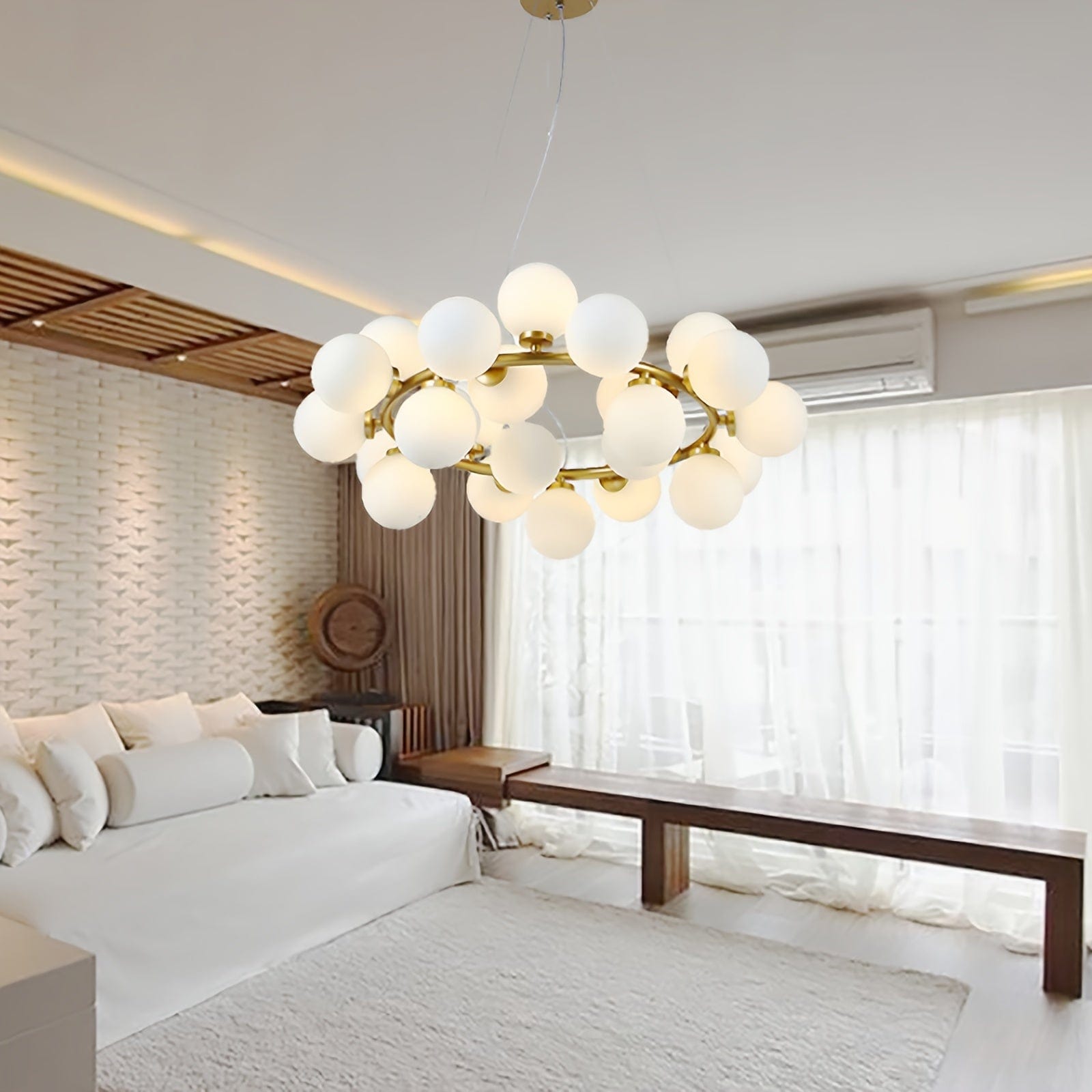
1Holly Milk Glass Chandelier
Opal · Diffuses Without FilteringOpal glass scatters light without removing much of the spectrum, which is why it suits rooms where color accuracy matters. A tinted or smoked shade does the opposite — it filters the output before it reaches the wall, shifting every color in the room toward the shade's own tint. If the paint is the point, the diffuser should be clear or opal, never colored.
Lamps: Replaceable — buy CRI 90+ with good R9
Avoid instead: Tinted and smoked glass where paint matters
Target: 2700-3000K across living spaces
Related: Glass chandeliers

2Asty Modern Ring LED Chandelier
Integrated LED · Specified, Not GuessedIntegrated LED has one advantage specific to this problem: the output is a fixed published specification rather than a variable depending on which lamps the owner happens to buy. Ask for the CRI figure before ordering — with a replaceable-lamp fixture you can correct a poor choice later, with an integrated one you cannot.
Ask before ordering: CRI and R9 figures
Why it matters more here: The source cannot be swapped
Also check: Dimming depth
Related: Ring chandeliers
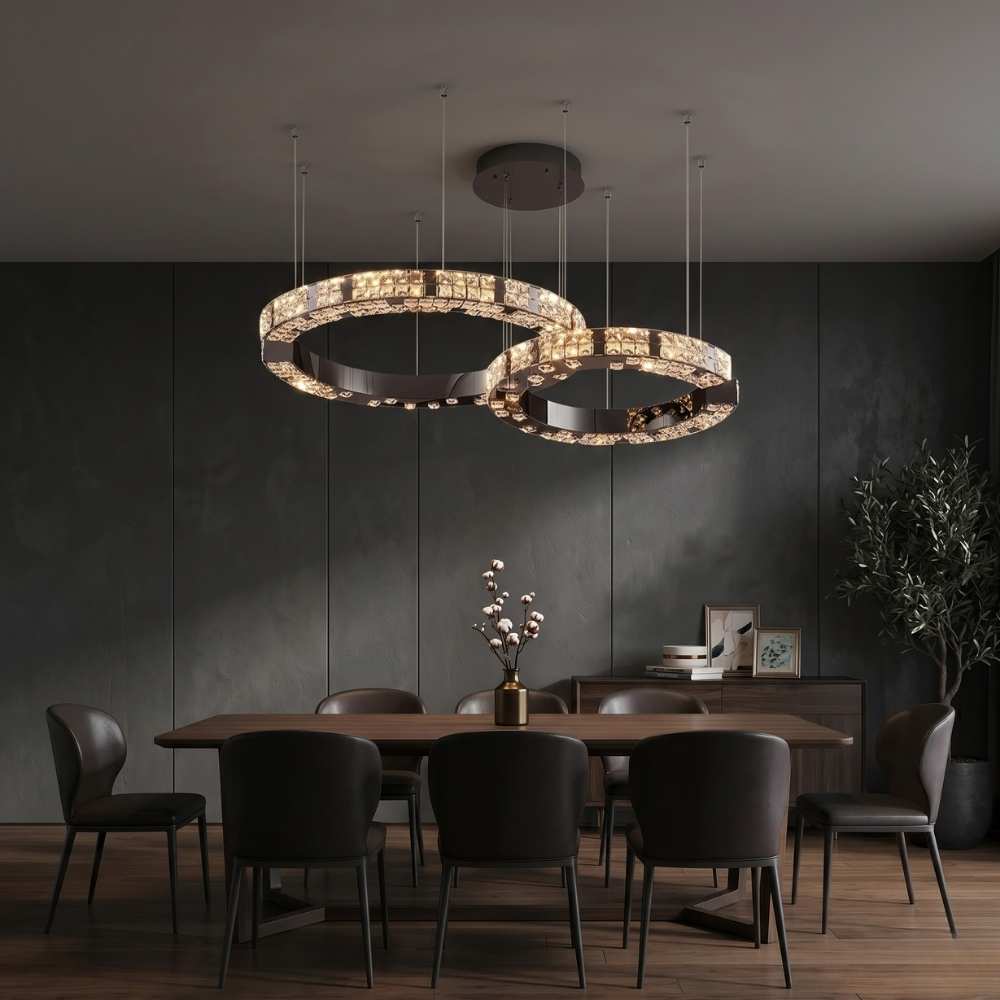
3Arven Modern Crystal Ring Chandelier
Clear Crystal · Refracts, Does Not TintClear crystal splits and redirects light without subtracting from it, so color rendering stays intact while the room gains refracted movement. Coated and color-treated crystal is a different proposition — it tints what passes through, which is a legitimate effect but a poor choice in a room where the wall color was chosen carefully.
Coated or tinted crystal: Tints the room — a deliberate effect
Color: 2700K with CRI 90+ lamps
Best at: 30-60% dimmer output
Related: Crystal chandeliers
How to Test Properly
Almost every failed paint choice traces back to testing under the wrong conditions. Five steps fix it.
- 1. Paint a large sample on the actual wall, not a chip held against it. A2 size minimum. Color reads differently at scale, and a white chip border distorts perception of what sits inside it.
- 2. Paint on two walls — one facing the window, one away. North-facing and south-facing light are different sources, and the same room contains both.
- 3. View it under your own bulbs, at night, with the fixtures you will actually live with. This is the step people skip, and it is the one that matters most.
- 4. View it at three times of day — morning, afternoon, after dark. Daylight shifts color temperature by thousands of Kelvin across a day.
- 5. If the fixture is not installed yet, fit a lamp of the intended Kelvin and CRI into a work light or table lamp and judge under that. Choosing paint before lighting and then matching lighting to paint is the sequence that produces the problem.
Room by Room
| Room | Target | Why color accuracy matters here |
|---|---|---|
| Living room | 2700-3000K, CRI 90+ | Fabric, timber and art all judged here |
| Dining room | 2700K, CRI 90+, good R9 | Food and skin tones — reds are the test |
| Kitchen | 3000-3500K, CRI 90+ | Food prep needs accuracy; cabinet color is a large surface |
| Bathroom | 3000-3500K, CRI 90+ | Makeup applied here is seen in daylight later |
| Bedroom | 2700K, CRI 90 | Warmth matters more than fidelity |
| Hallway | Match the rooms it connects | Seen alongside both — mismatch is visible |
Picks by Room Condition (3 Designs)
Where the room's own light conditions shape the fixture choice — a dark room, a north-facing room, or a space where the walls themselves need lighting.
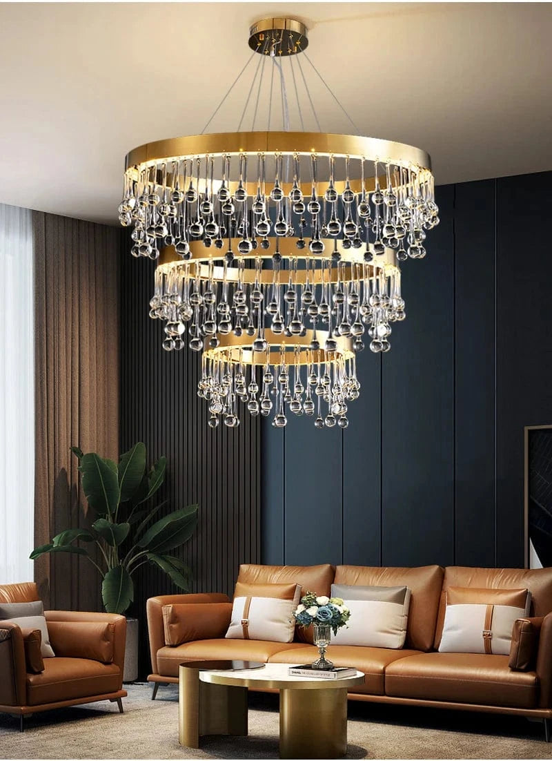
4Alvin Gold Ring Chandelier
North-Facing Rooms · Warm Metal CompensatesNorth-facing rooms receive cool, blue-shifted daylight all day, which pulls warm paint colors toward gray. A warm-metal fixture adds amber back into the room even before the lamps are switched on — a small compensation, but a real one in a room that otherwise fights every warm color in it.
How: Warm metal adds amber before the lamps do
Pair with: 2700K lamps, CRI 90+
Sizes: Six, up to 39.4" (100 cm)
Related: Gold chandeliers
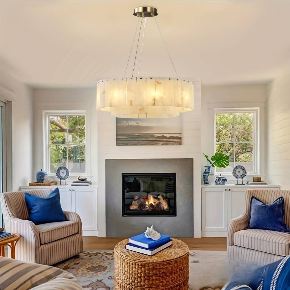
5Angie Alabaster Round Chandelier
Stone · Warms What Passes ThroughWorth understanding rather than avoiding: stone warms the light passing through it, which means the fixture contributes its own shift to the room's color. In a room with warm paint that is an asset; in a room with carefully chosen cool grays it is working against the scheme. Know which you have before choosing a stone diffuser.
Asset in: Warm palettes, timber, terracotta
Fights: Cool grays and blue-toned schemes
Pair with: Other layers — stone is low output
Related: Alabaster & marble

62-Pack Marble Sconce Wall Light
Wall Lighting · Where the Paint Actually IsA ceiling fixture lights the room; a wall fixture lights the wall. If the paint color is the thing you want seen properly, wall lighting does more for it than any ceiling fixture can — and a pair washing a feature wall is how a color gets read as intended after dark rather than fading into shadow.
Mount at: 60-72 in to center
Effect: Keeps wall color visible after dark
Sold as: A matched pair
Related: Wall sconces
Browse by lighting quality
Opal, clear glass and wall fixtures for rooms where color matters.
Glass Chandeliers → Wall Sconces → All Chandeliers →Open Plan: One Temperature
In an open-plan space the problem compounds, because two light sources are seen at once and the eye compares them directly.
A kitchen at 3500K beside a living area at 2700K does not read as zoning — it reads as a mistake, and it makes the paint look like two different colors across one continuous wall. Pick one color temperature for the whole plan, usually 3000K as the compromise, and create zone separation with brightness and fixture type instead.
The same applies to a hallway connecting rooms of different schemes. It is seen from both ends, so it should match the warmer of the two rather than splitting the difference — a cool hallway between two warm rooms reads as a gap.
Common Mistakes
- Choosing paint before lighting. The sequence that causes the problem. Decide the Kelvin and CRI first, then test paint under it.
- Judging a chip instead of a painted wall. Scale changes perception, and the chip's white border distorts what sits inside it.
- Testing only in daylight. Half the room's life is after dark, under lamps that bear no relation to the sun.
- Ignoring CRI. Two bulbs at the same Kelvin can render color completely differently. CRI 90+ wherever color matters.
- Assuming CRI 90 covers reds. Check R9 separately — it is where cheap high-CRI claims break down.
- Painting one test patch on one wall. Window-facing and window-opposite walls receive different light in the same room.
- Mixing color temperatures in an open plan. The wall looks like two colors across one continuous surface.
- Using tinted or smoked shades in a carefully colored room. They filter the spectrum before it reaches the wall.
- Blaming the paint. It is doing exactly what it was formulated to do with the light it was given.
Frequently Asked Questions
Why does my paint look different at home than in the store?
Because the light is different. A store's lighting has a different spectral makeup from your bulbs, and paint can only reflect wavelengths the light source supplies. The paint has not changed — what it has to work with has. The term for this effect is metamerism.
What is metamerism in paint?
Two colors matching perfectly under one light source and not matching at all under another, because they were formulated from different pigments with different spectral behavior. It is why a chip and the wall beside it can agree in daylight and disagree under a lamp.
Does changing the bulb change how paint looks?
Yes, substantially. Color temperature shifts whether a color reads warm or cool, and CRI changes how faithfully it is rendered at all. Changing lamps is often a faster and cheaper fix than repainting.
What is CRI and why does it matter for paint?
Color rendering index measures how accurately a light source reveals color. A low-CRI lamp has gaps in its spectrum, so pigments relying on those wavelengths have nothing to reflect and the color reads flat or dirty. Two bulbs at the same Kelvin can differ completely in CRI.
What color temperature is best for showing paint accurately?
3500K is closest to how a swatch reads in a showroom, but 2700-3000K is right for living spaces. The answer is to choose the temperature the room needs and then test the paint under it, rather than choosing paint first and discovering the mismatch afterwards.
Which paint colors change the most under different lighting?
Grays and greige, because they are mixed from several pigments and the balance between them tips when the light source changes. Off-whites are second, since the undertone is their whole character. Saturated single-pigment colors shift least.
What is R9 and why does it matter?
A sub-measure of CRI covering deep red. A lamp can reach CRI 90 overall with poor R9, and reds, terracottas and warm timber will still look dull. It matters most over a dining table, where food and skin tones depend on it.
How should I test paint colors properly?
Paint a large sample on the actual wall — two walls if one faces a window — and view it under your own bulbs at night, plus at three times of day. If the fixture is not installed, fit a lamp of the intended Kelvin and CRI into a work light and judge under that.
Should I choose paint or lighting first?
Lighting, or at least the lamp specification. Choosing paint first and then matching lighting to it is the sequence that produces the mismatch, because the paint was judged under conditions that will not exist in the finished room.
Does the light fixture itself affect paint color?
Yes, through its diffuser. Opal and clear glass transmit the full spectrum; tinted, smoked and colored glass filter it before it reaches the wall, shifting every color in the room toward the shade's own tint. Stone warms what passes through it.
Can I use different color temperatures in an open plan?
Better not to. Two sources seen at once are compared directly, so a 3500K kitchen beside a 2700K living area makes one continuous wall look like two colors. Pick one temperature and zone with brightness and fixture type instead.
My north-facing room makes every color look cold. What helps?
North light is cool and blue-shifted all day. Warm-metal fixtures add amber back into the room before the lamps are even on, 2700K lamps counter the daylight after dark, and wall lighting puts warm light directly onto the surfaces that are reading cold.
Specify the Light, Then Pick the Paint
Kelvin decides whether a color reads warm or cool; CRI decides whether it is rendered honestly at all. Settle both before the paint is chosen, test large samples on real walls under the actual bulbs, and the color that looked right in the store will still look right at eight in the evening.
Browse the range: glass chandeliers, wall sconces, all chandeliers.